Logo Ideation
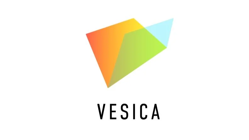
CONCEPT #1
A financial data company is a living organism. Markets change, technologies change, and Vesica will change with them too. An abstract mark can help to weather these changes - as market conditions grow, shift and scale, so can Vesica.
Formally these abstract shapes echo the Vesica V while their color and gradation beautifully bring together two different elements to create a third.
We made this iteration as light as possible, using only color blocks with no lines or hard structure. It stands out as an inviting and agile form.
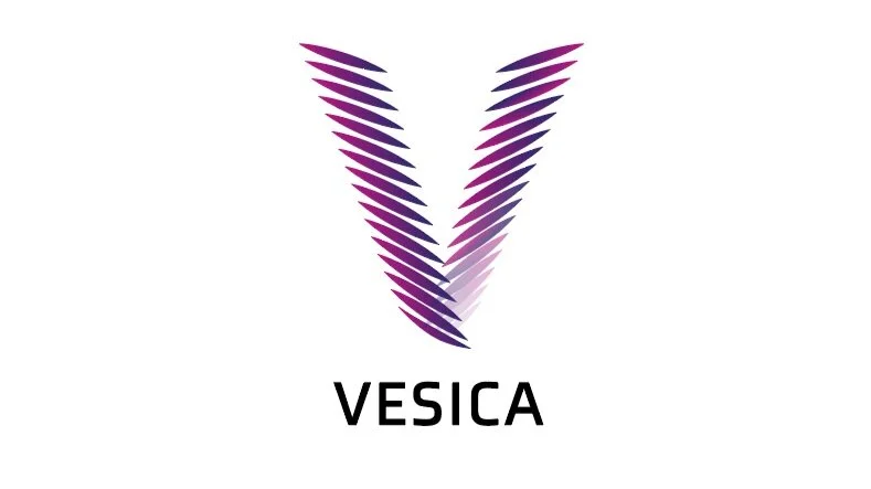
CONCEPT #3
The feathered V made of multiple nodes represents the volume of financial data Vesica aims to make relevant and accessible. Using a letterform strategy means high brand visibility and is immediately recognizable.
The two pillars of the V also allude to the two energies that drive Vesica’s culture- the business acumen of Wall Street Veterans, and the creativity of Silicon Valley.
The V is a strong symmetrical shape, but we found solid versions of it to be too aggressive. The gradation and feathered texture keeps the design light, offering a sense of depth and inviting the viewer in.

CONCEPT #2
The staircase is a visual mark that declares Vesica’s commitment to all market participants “leveling up”.
The gradient color palette is inviting and eye catching while the negative space between the steps gives it a dynamic sense of upwards movement.
The interlocking shape of each step is an interpretation to the idea of Vesica as an intersection, while not literally representing it with a Vesica Pisces.
The logo also represents organized hierarchy, calling back to Vesica’s mission to create order our of arbitrary financial data.
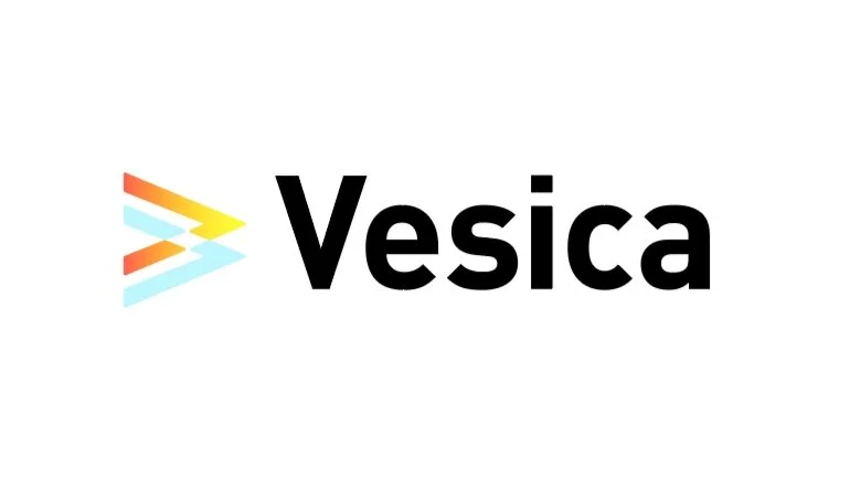
CONCEPT #4
This concept also shows the collision of two different energies but centers its design around negative space. The arrow shapes serve as a visual reference to the Vesica V, and to market graphs.
Finally the hard corners have been rounded off to make it feel less aggressive.