

Brief
FPM Partners (formerly FPC Group) is a real estate investment manager focused on multifamily properties. Since inception it has acquired $1 billion in multifamily assets and is focused on investing in high-growth markets with strong employment and population drivers. Our design challenge was to create a visual identity that centered the firm’s commitment to institutional quality, and intelligent growth.
Design Process
Role: Lead Designer
I led the project from concept to production– developed logo directions and presented them to the client, then built the approved direction out into a full brand identity, website and set of marketing materials.
-
The palette centers on a deep Alpine blue. It calls to mind the open skies of the Mountain West, where FPM Partners is based, and hints at how wide the firm's range of investment opportunities is.
-
Two sans serif typefaces give the brand both character and clarity, in keeping with a modern financial institution. Optima is a humanist sans serif based on classical Roman letterforms, and it adds warmth and a timeless quality. TT Norms Pro Semibold is a geometric sans serif that provides a clean, highly readable contrast.
-
Taking cues from the Four Peaks name, I designed a set of geometric icons and graphic elements based on mountain shapes. They express the upward momentum of the firm's portfolio.
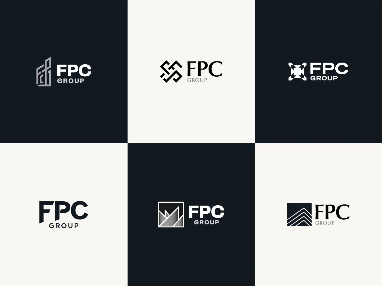
Logo Ideation
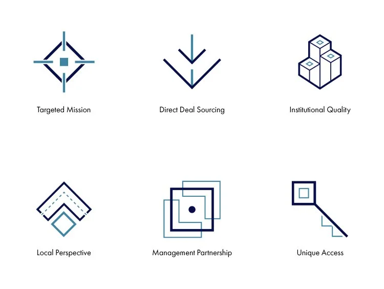
Icon Design
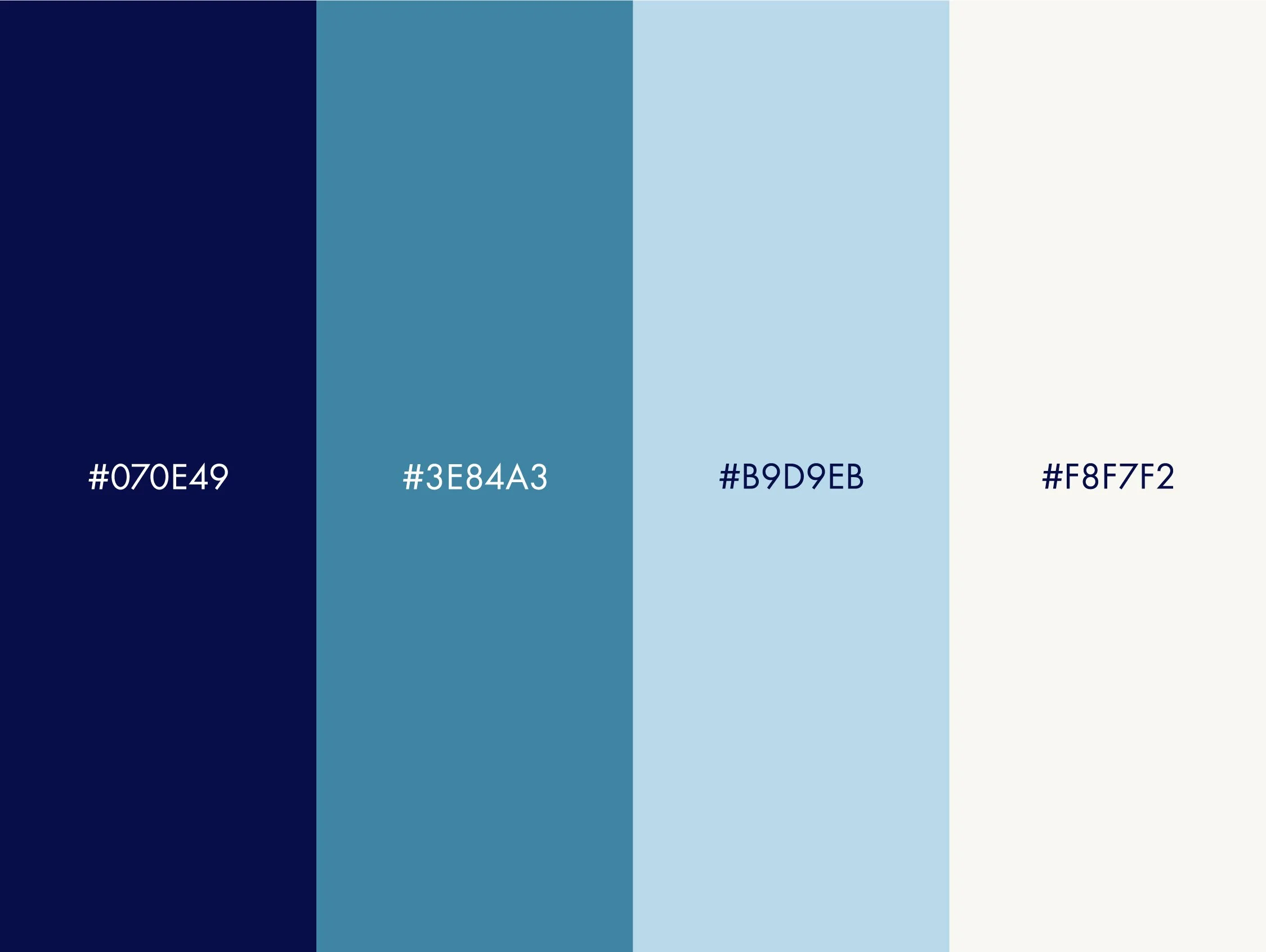
Brand Colors

Brand Imagery
Website
Stationary
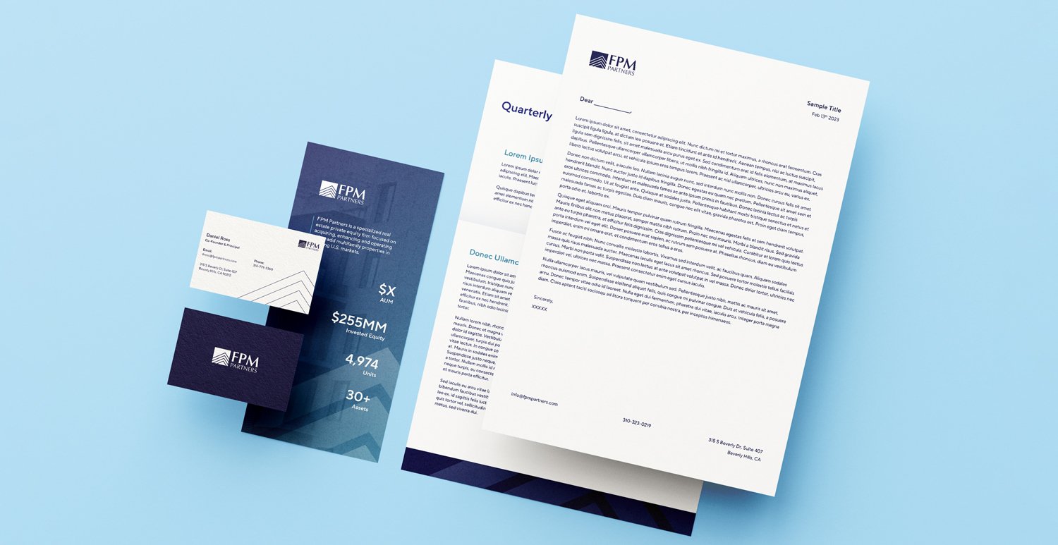
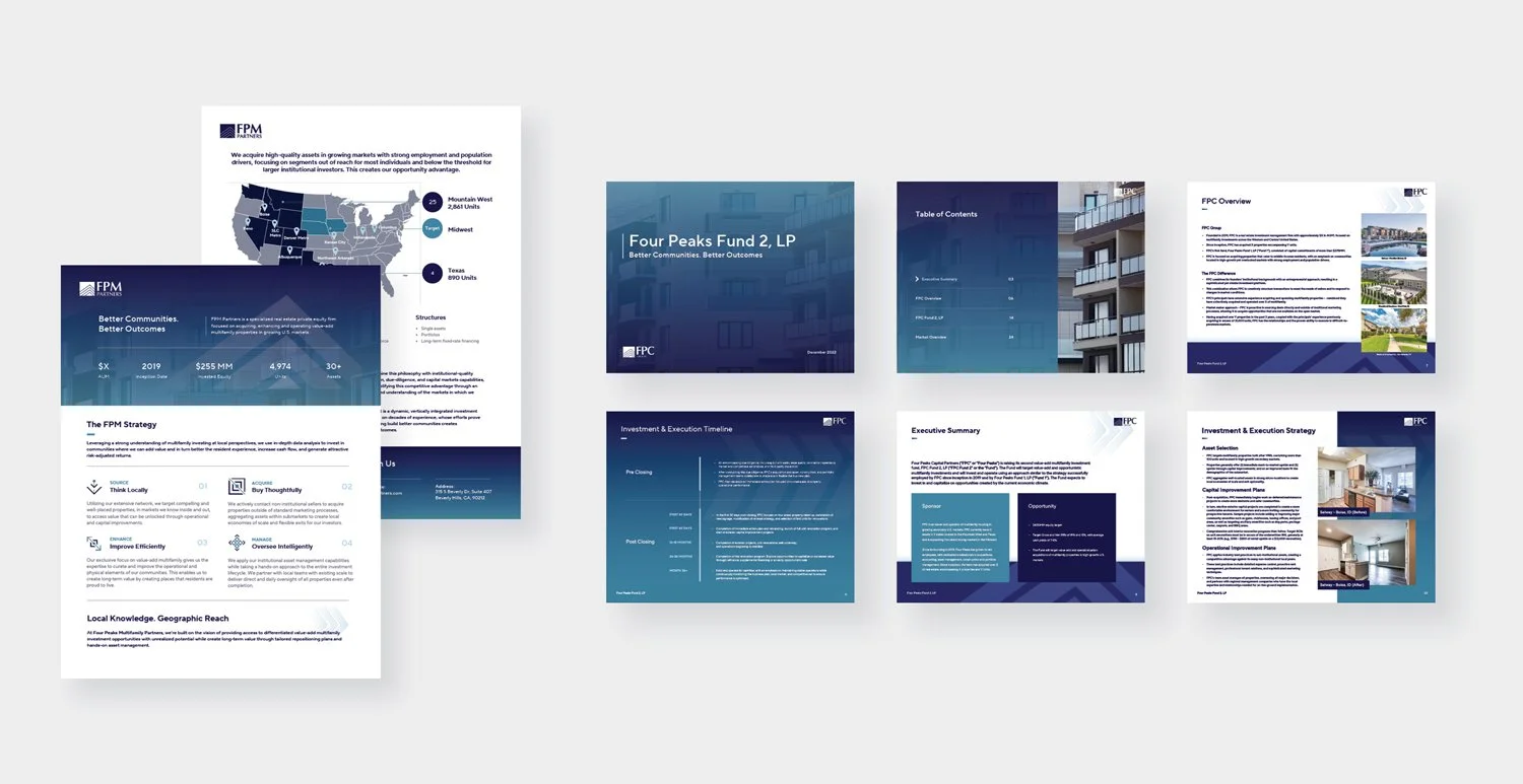
Presentation Design
Results
The identity launched across the website, pitch decks, investor one-pagers, property signage, and email templates, giving FPM Partners one consistent look everywhere it meets investors and partners.
Today, the identity represents a firm managing $1.3B in assets across 38 properties in 12 markets across the US.